
In the realm of data analysis and visualization, histograms stand as one of the most fundamental and powerful tools available to data scientists, statisticians, and analysts. Python, with its rich ecosystem of libraries and straightforward syntax, has emerged as a preferred language for creating these insightful graphical representations. This article explores the concept of histograms, their importance in data analysis, and how to effectively create and customize them using Python's popular visualization libraries.
Understanding Histograms
A histogram is a graphical representation that organizes a group of data points into user-specified ranges. It provides a visual interpretation of numerical data by showing the number of data points that fall within each range. Unlike bar charts that compare different categories, histograms display the distribution of a single variable across a continuous range.
Key Components of a Histogram
- Bins: The ranges into which data is categorized
- Frequency: The count of data points falling into each bin
- Shape: The overall pattern formed by the bars (normal, skewed, bimodal, etc.)
- Density: When normalized, shows the probability distribution
Histograms help analysts identify patterns, outliers, and the underlying distribution of data—whether it follows a normal distribution, is skewed, or has multiple peaks.
Python Libraries for Creating Histograms
Python offers several libraries for histogram creation, each with its own strengths and use cases:
Matplotlib
The grandfather of Python visualization libraries, Matplotlib provides fundamental tools for creating histograms:
import matplotlib.pyplot as plt
import numpy as np

# Generate random data
data = np.random.normal(100, 15, 1000)

# Create a histogram
plt.hist(data, bins=30, color='skyblue', edgecolor='black')
plt.title('Normal Distribution Histogram')
plt.xlabel('Value')
plt.ylabel('Frequency')
plt.grid(True, alpha=0.3)
plt.show()
Matplotlib offers extensive customization options and is perfect for those who want fine-grained control over their visualizations.
Seaborn
Building on top of Matplotlib, Seaborn provides a higher-level interface with aesthetically pleasing defaults:
import seaborn as sns
import numpy as np

# Generate random data
data = np.random.normal(100, 15, 1000)

# Create a more sophisticated histogram
sns.histplot(data, kde=True, bins=30, color='skyblue')
plt.title('Histogram with Kernel Density Estimate')
plt.show()
Seaborn's histplot function offers integrated kernel density estimation (KDE), making it easier to visualize the probability density function alongside the histogram.
Pandas
For those already working with DataFrames, Pandas provides convenient methods for histogram creation:
import pandas as pd
import numpy as np

# Create a DataFrame with random data
df = pd.DataFrame({
    'A': np.random.normal(0, 1, 1000),
    'B': np.random.normal(5, 2, 1000),
    'C': np.random.normal(-5, 3, 1000)
})

# Create histograms for each column
df.hist(bins=20, figsize=(10, 6), grid=False)
plt.tight_layout()
plt.show()
Pandas makes it exceptionally easy to create multiple histograms at once, perfect for exploring datasets with multiple variables.
Plotly
For interactive, web-ready visualizations, Plotly offers dynamic histogram capabilities:
import plotly.express as px
import numpy as np

# Generate random data
data = np.random.normal(100, 15, 1000)

# Create an interactive histogram
fig = px.histogram(data, nbins=30, title='Interactive Histogram')
fig.update_layout(xaxis_title='Value', yaxis_title='Count')
fig.show()
Plotly's interactive features allow users to zoom, pan, and hover over specific bars to see exact values.
Advanced Histogram Techniques in Python
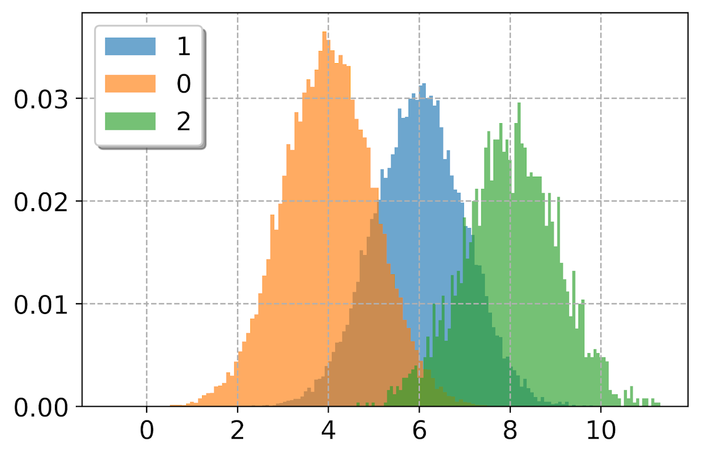
Multiple Histograms for Comparison
Comparing distributions is a common analysis task. Python makes it straightforward:
import matplotlib.pyplot as plt
import numpy as np

# Generate two datasets
data1 = np.random.normal(0, 1, 1000)
data2 = np.random.normal(0.5, 1.2, 1000)

# Create overlapping histograms
plt.hist(data1, bins=30, alpha=0.7, label='Dataset 1')
plt.hist(data2, bins=30, alpha=0.7, label='Dataset 2')
plt.legend()
plt.title('Comparing Two Distributions')
plt.show()
2D Histograms (Heatmaps)
For analyzing the relationship between two continuous variables:
import matplotlib.pyplot as plt
import numpy as np

# Generate 2D data
x = np.random.normal(0, 1, 1000)
y = x * 0.5 + np.random.normal(0, 0.8, 1000)

# Create a 2D histogram
plt.hist2d(x, y, bins=30, cmap='Blues')
plt.colorbar(label='Count')
plt.title('2D Histogram')
plt.xlabel('X Value')
plt.ylabel('Y Value')
plt.show()
Cumulative Histograms
To visualize the cumulative distribution function (CDF):
import matplotlib.pyplot as plt
import numpy as np

# Generate data
data = np.random.normal(0, 1, 1000)

# Create a cumulative histogram
plt.hist(data, bins=30, cumulative=True, density=True,
         histtype='step', linewidth=2)
plt.title('Cumulative Distribution Function')
plt.xlabel('Value')
plt.ylabel('Cumulative Probability')
plt.grid(True, alpha=0.3)
plt.show()
Histogram Analysis and Interpretation
Creating a histogram is only the first step. The real value comes from interpretation:
Distribution Shapes
Different distribution shapes reveal different data characteristics:
- Normal (Bell Curve): Symmetric, with most values clustered around the center
- Skewed Right: Tail extends to the right, indicating outliers in the higher values
- Skewed Left: Tail extends to the left, indicating outliers in the lower values
- Bimodal: Two peaks, suggesting two different groups within the data
- Uniform: Similar frequencies across all bins, indicating an even distribution
Statistical Insights
Histograms help identify:
- Central Tendency: Where most data points cluster
- Spread: How wide the distribution is
- Outliers: Unusual values that fall far from the main distribution
- Gaps: Ranges where data points are absent
Best Practices for Creating Effective Histograms
- Choose Appropriate Bin Sizes: Too few bins oversimplify the data, while too many can create noise
- Consider Normalization: For comparing datasets of different sizes, use density instead of frequency
- Include Context: Always label axes and include titles to provide context
- Color Wisely: Use color to enhance understanding, not just for decoration
- Add Reference Lines: Include mean or median lines to provide additional context
Real-World Applications
Histograms find application across numerous fields:
- Finance: Analyzing return distributions and risk profiles
- Healthcare: Examining patient metrics and treatment outcomes
- Manufacturing: Quality control and process improvement
- Environmental Science: Analyzing pollutant concentrations or temperature distributions
- Education: Evaluating test scores and learning outcomes
Summary
Python's versatile visualization libraries make histogram creation accessible to anyone with basic programming knowledge. Whether you need a quick data exploration tool or a publication-quality visualization, Python provides the flexibility and power to meet your needs. By mastering histogram creation and analysis in Python, you gain a fundamental data visualization skill that enhances your ability to extract meaningful insights from numerical data.